|
This is pretty exciting really. Not only will we be able to use one of the lovely art rooms in the school but if you're a car driver you will be able to, whisper it, use the school carpark. For a venue in the centre of Bristol this is quite something. (Disclaimer, there will be other activities in the school on the evening so you won't always be guaranteed one but it's still pretty good to have the option.) But which entrance do you need to go through to find the art room? Because a picture is, of course worth a thousand words take a look at the pictures below. The first one shows the main student entrance to the school on Cotham Lawn Road The second one shows the entrance to the to the right of the main student entrance. This connects to a small car park at the end of which is a security gate. On the evening someone will be manning this gate from about 6.40 onwards and the art room is just a short walk on the other side of the playground. 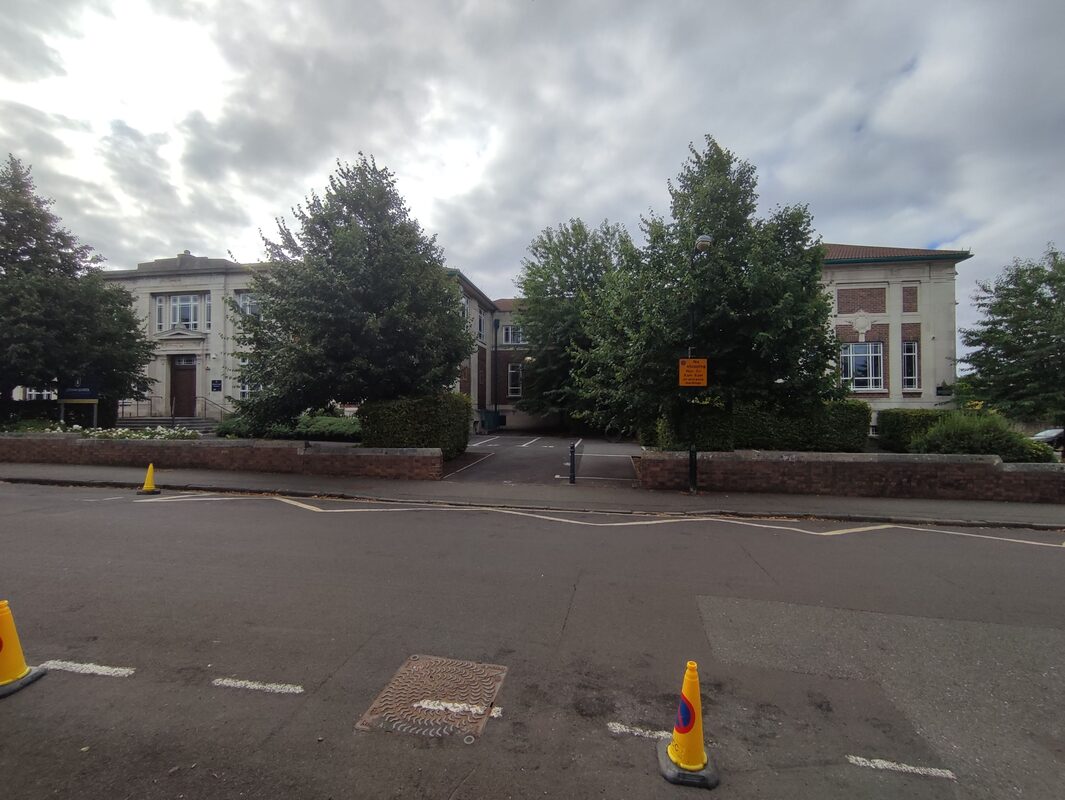 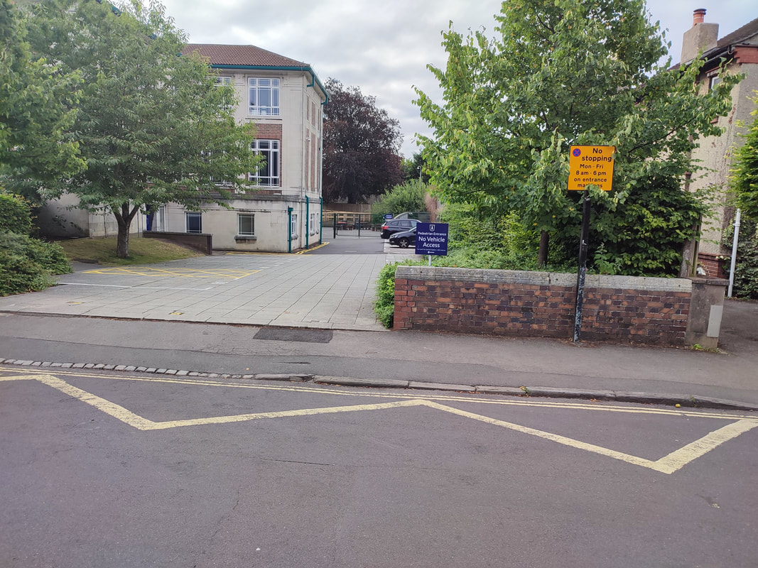
0 Comments
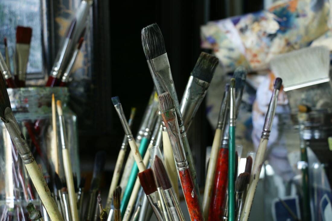 .
So you've decided that you'd like to learn how to paint and draw? Well done you! Approach it in the right way it will bring you many joys. On this and further blog posts I'm going to be providing advice on art materials for all budgets to help point you in the right direction but bear in mind that if you come along to one of our own classes you don't have to buy anything yet as all materials are included in the cost of the course Providing all materials for these classes to students at no extra cost may not seem a lot but if you attend a Paint and Draw class (click for more details) you could easily be saving an extra £20-£30 and maybe more If you visit www.greatart.co.uk you'll find a starter set of ILoveArtAcrylic for £10.49 I'm a big fan of this acrylic, most of the colours have at least a good lightfastness rating and each tube packs a generous 120ml of paint. If you wanted a reasonably starter set of acrylic I look no further although it's possible that some class material lists might ask you to buy some extra tubes . Factor in the cost of an A4 sketchbook, if you do a search on www.amazon.com for watercolour books you'll find a lot of reasonably priced Chinese ones for around £8. (They seem pretty chunky, 300gms is a good weight of paper to go for. I haven't tried any of these so can't vouch for their quality but on previous experience they ought to be ok.) Brushes could be bought again from Amazon. A quick search for acrylic brushes brings up these. As with the sketchbooks I can't vouch for the quality of these. (Some of them have fabulous names though, Estenpumpful being my out and out favourite) but anything with orange nylon, sometimes called taklon can stand up to a lot of punishment and will be certainly be a big improvement on the hogshair brushes that I used to use when I was a student. It's difficult to judge how big some of them are but looking at the photographs of these the price seems good and they certainly have nice long handles. Add these items together and you have £25.39 and notice I have yet to factor in the cost of kitchen roll, palette, pencils, rubbers and sharpeners. If you include that you are pretty close to the £30 mark. It's easy to spend more. In later blog posts I will talk about some of the really lovely materials that are out there but this, for the time being is the sort of price that you would need if you were just starting out. You could go a little cheaper with the paints if you wanted to. These acrylics from The Works are very cheap indeed and are well reviewed although I can't help thinking that they must be making some economies somewhere, pigment quality perhaps? I'd probably go for the larger sized tubes which while still being pretty cheap will give you plenty of spare paint to experiment with. A small amount is fine if you know what you're doing but when you're learning you will soon get through a 37 ml tube. I haven't mentioned the countless brands of artists paints out there in the art departments of those countless warehouse stores in retail parks across the country. (You know, the kind where you can buy everything from furniture to plastic storage tubs to bin bags). I was able to buy a set of watercolours at one once for a single pound but they were very hard to apply as a wash and pretty useless for that reason. If you have a Range near you I'd pop in as there art department has a pretty good range of well know brands from Winsor and Newton and Daler Rowney as well as the cheaper ones. What happens though if you source all of these materials and then having bough them decide that acrylic is not for you and you'd actually prefer, watercolour, or oil? Again, that's the advantage of these classes. Try before you buy. Have you found a particular brand of paint or brush that you love working with and that I haven't mentioned? I'm always interested in finding out more myself so please feel free to leave a comment at the end of this post. Until the government advice changes and as per other adult education providers in the Bristol area I still plan to run the new batch of classes starting on January 10th 2022.
Current mask wearing rules will apply however and each student will have a table to themselves. Windows will be open and art materials will be on the table as you come in. If you have any queries related to this please email me on [email protected] Thanks for visiting this website. As well as giving an overview of a different technique each week I usually give a short presentation that will introduce to you an art historical term or two, the work of an artist or the history behind a particular material. Nothing too long, but it's a good way of giving people a break and people generally find it quite helpful. For more check out my other website www.lifedrawingclasses.co.uk I also have another wordpress blog www.beginnersartclasses.wordpress.com which contains information related to my past experiences as a tutor and some of the artists I've found and hope you will find inspirational I'll also be posting some stuff here so keep popping back every couple of weeks and I'll try and get some new stuff for you to look at. |
You've found the blog for the Paint and Draw Bristol and Bath art classes for adult beginners that are run by Will Stevens. We'll be running classes near you again soon and you can find out more if you click here. Meanwhile read on for advice about art materials drawing techniques and the great works of art out there there that you can enjoy
Will StevensWill Stevens has taught beginners classes in Bristol for 25 years now He has also taught privately on a one to one basis, at residential homes , the University of Bristol Arts Society the Sky Arts Den at the Bath Literary festival. (You can see some pictures on the gallery page) He's given drawing tips to Laura Rawlings on her afternoon radio Bristol show and most recently given a talk on Ipad painting to the Clifton Arts Club in Bristol. For some comments about Will and his friendly, teaching style have a look at the testimonials page. Archives
July 2022
Categories |
 RSS Feed
Testimonials"Having never been taught art before I have really enjoyed the classes, learning about some of the mysteries of drawing and painting in such a relaxed and informal atmosphere. My friends have been impressed with what I have produced". To read more testimonials click here
|
The Gallery
Would you like to see images of some of the many people that have enjoyed this class over the years? Click here
|